Sunday, December 18, 2011

Ludum Dare 48 #22: Sol Solo

I know I've forgotten something, but here it is: my first Ludum Dare 48 entry:

Sol Solo title screen
I spent the last few hours scrambling to pack some last-minute polish in. I was cranking out sound effects from a Roland XP-60, frantically paging through the manual for the soundbank listings, punching it into Audacity, saving, hooking up instances.

And there was a ton of worrying about invisible features. Should I hook in Playtomic? Nah, too risky with only 40 minutes to go. A trackback link? Oh yeah, definitely. Sitelocking? Duh, what am I thinking? That'll just backfire. I'll just have to search the net and see where it ends up.

The main game screen.
Man, my head is a bit scattered right now. I'll come back to talk about the experience some more in a while, but I need a break. For now, if you want to see it in action (or even try it and rate it!), here's my LD48 entry page.


Monday, December 5, 2011

Life as an Indie

Both Christina's and Gareth's tweets this morning reminded me of a blog topic I've been meaning to write. Back when I was first considering becoming an indie game developer, I had a lot of questions about indie development. I found a number of blogs started by other indies, and read them ravenously.

One area that I found particularly interesting was indie life. What was it like to wake up as an indie? What types of problems did they confront? What was their workday like? What did their desk look like? Their room? I guess it was sort of fantasy fulfillment to read others' blogs. A few minutes of escapism before I had to get back to my then reality.

I figured when I finally got around to going indie myself, I'd do a post with just those details. I dunno how many folks are as into it as I was, but maybe there are a few who enjoy peering into the fishbowl. Plus, a friend of mine has been asking about how I keep up my work ethic, so this'll be good prep for answering that question.
Where I sit. Tools include desktop PC, older laptop, Wacom tablet for pixel art, portable audio recorder (fuzzy thing on top shelf), musical instruments on right. Detective fan optional.

How I handle my work schedule

My schedule is actually quite consistent. I treat my work day pretty much like I did at previous employers. I work Mondays through Fridays, about 40 hours per week. I take the same holidays BioWare does: roughly 10 stat days, 3 weeks "paid" vacation, 1-2 weeks "paid" break at Christmas (likely only 1 for Christmas this year). (Note: I say "paid" in quotes because I haven't made dollar one yet as an indie. BioWare does pay employees for regularly scheduled time off.)

I'm actually protective of both my work time and my play time. When I miss an hour or more of work, I log it. When I work overtime to cover the missed work, I log it. I log everything I do in a day in a big text file. It reads kinda like a changelog for a game patch, but with dates. Here's an example:

2011/12/03
made hexes show appropriate random scavenge locations
made hexes have finite scavenge locations that slowly replenish over time
made scavenging button only appear if current hex has available scavenging, and no creatures nearby
Created mushroom items (poison and edible, incl unidentified)
Created crowbar and related attackmode.
Created poisoning condition (for use with poison plants)
Typical daily schedule

My days are also quite consistent. I've sort of setup my days around short, regularly scheduled islands of rest and reward. It's never more than an hour or two until something I'm looking forward to, like food, coffee, chatting with Rochelle, etc. Here's how a typical day looks:
  • 06:30 - Wake up, throw on pjs, turn on PC, make some English Breakfast tea.
  • 06:45 - Tea made. Sit at computer, and start checking mail and social media sites.
  • 07:15 - See Rochelle off to school.
  • 07:20 - More reading/browsing. Maybe a short game of something. Bi-weekly, this is where I'd start composing a blog post (as I'm doing today).
  • 08:45ish - Somewhere around here, I usually start my morning routine (brush teeth, shower, feed the cat, etc.)
  • 09:20ish - Boil some water for another cup of tea.
  • 09:30ish - Launch FlashDevelop, Photoshop, and Windows Explorer. Close all other windows, including browsers. Browser use exclusively for AS3 documentation, phpMyAdmin, and other work research.
  • 12:00 - Lunch time. Turn off monitor and go into kitchen for some lunch. Usually read Twitter and Gamasutra on a laptop at the kitchen table while I eat.
  • 13:00 - Back to work. I may afford myself a few minutes to check email again at this time. But then browsers are off, and work is on.
  • 14:00ish - Take a break and make some coffee. I often try to push this until 15:00ish instead, so it divides the afternoon better.
  • 14:10ish - Coffee made, back to work.
  • 16:00ish - Rochelle comes home from school between 12:00 and 17:00, depending on the day. I usually take about 10-15 minutes to chat with her before getting back to work.
  • 16:15ish - Back to work.
  • 18:30 - Work finished. Close FlashDevelop, Photoshop. Verify work log is up-to-date, then check-in all files to version control. Most days, check-ins are working code. Large refactors may mean skipping nightly check-ins until game is stable again. In those cases, usually no more than 2-3 days between check-ins.
  • 18:45ish - Start making dinner with Rochelle, depending on required prep time.
  • 19:30ish - Eating dinner.
  • 20:15ish - Free time begins. Usually a mix of watching shows with Rochelle, playing games, or reading stuff on the web. Dishes usually need doing sometime before bed, so there's a bit of dish time in here somewhere too.
  • 22:30ish - Start getting ready for bed. Usually asleep before 23:00.
There are a number of bathroom breaks in there too, of course (all that tea and coffee has to go somewhere!).

The view from my seat. This is a bit more like how the desk normally looks, with a few random things spread around. The digital picture frame on the left cycles through inspirational art.
Staying focused

I have to admit, my mind isn't always cooperative. My focus and effectiveness tends to drain the longer I sit at the computer. And the end of the day can sometimes be trying. However, there are a few things I do to mitigate distractions and lack of motivation.

I find that keeping regularly scheduled work and break times helps me focus and not get distracted. It's always clear whether I should be working or not. I think that without a consistent schedule, it'd be easy for me to lose track of how much work I'm doing (or not doing).

I've learned to recognize times when I've been staring at a problem, cyclically running through the same thought process, and not making any progress. When that happens, I have to force myself to get up and walk away. Simply standing up and walking around seems to clear my head. So the breaks (whether they be coffee, bathroom, or whatever) do a lot to keep me on task.

Decision fatigue can also plague me from time-to-time. Sometimes, I feel overwhelmed by the sheer amount of stuff left to do, and I can't focus on anything. This is where having a prioritized backlog can be a big help. I keep a running "to do" list in an Excel sheet, and any time something comes to mind that I won't immediately address, I add it to that sheet. And periodically, I'll go over the list, deciding on each item's value and effort.

The benefit of this exercise is that I can turn to this sheet in times of indecision or lack of direction. One quick data sort later, and I can see a list of "best bang for the buck" tasks, or "biggest risks." Then, I don't have to decide what to work on next, I just run down the list, sniping each task in turn.

When I'm having a particularly hard time focusing at the end of a day, it's usually because I've been stuck on the same problem for too long. The backlog can also help here. The previously mentioned "best bang for the buck" sorting means I can get a list of short, meaningful tasks to work on at a moment's notice. Often, these are a good break from the day-long task I've been on, and I manage to squeeze productivity out of that last hour.

Which reminds me, there are even some mornings where it can be hard to get back to work. On such days, it's usually because I'm dreading the task at hand, especially if I'm picking up from the previous day, and not sure how to continue. One trick I've used a bunch to avoid morning malaise is something Hemingway did: quit while you're ahead. (And, as it turns out, so did Roald Dahl!)

Or, when all else fails, look out the window.
So there you have it. A brief glimpse into my life as an indie, and some of the tips I use to stay on-task. If you have any tips of your own, I'd love to hear them! Or if you've seen other blog posts along this vein, those too. (Especially with workspace pictures and window views, yum.)

Oh, and immigration!

Also, as mentioned in November, I had a meeting with immigration. It's official: I'm a permanent resident! I sort of expected I'd be told to wait another 2 months for my card to arrive, but it turns out the card is just for airlines. I am a landed immigrant as of last week!

Now starts the deluge of questions about forming and running a company, on top of building a game. But hey, that's a better problem to have than waiting in the dark for an answer ;-)

Monday, November 21, 2011

Refactor Bonanza

Pride Goes Before a Fall

Those Twitter-enabled readers might remember me bragging about resisting the urge to refactor a system a while ago. Well, turns out hubris is still alive and well. Several days after my proclaimed victory, a use case failed, and four hours of tracing spaghetti code later, I was still no closer to fixing it.

That system, of course, was the inventory system. And the use case was stacking items. Several months of iterative development combined with changing requirements led to a system fraught with confusing methods. Methods with names like "TryFitItem," "CheckFitItem," and "ItemFitsInCapBox." Can you tell what each of those does differently? I can't. And I wrote them!

It turns out those functions were not only confusing to work with, but wasteful of the CPU as well. They did a lot of equipping and unequipping of items, shuffling them around in different containers, all in an effort to see where they fit best. And while all this was going on, the buffs/debuffs for the items were stacking and unstacking with each check. Then, when this rigmarole was over, all I got back was a boolean. Or in some cases, not even that explicit (e.g. a point that might be null). What does this boolean mean? Did the object fit where it was? Or did it stack? Or maybe the user wanted to swap it with the item underneath it?

I decided to refactor. It took several days (~2.5), but it's a much cleaner system now. The methods are more compartmentalized, so each has a clearer function. They do less actual moving of items, and more hypothetical testing of new positions (saving processing time). They do things in a more consistent way. And most of all, they return more contextual information in the result.

New Resolution

I also changed the game resolution from 1280x720 to 800x600. This change resulted from a performance test, but is meant to address a business issue. Originally, the game was done at 720p, with assets all scaled 2x for the retro "fat pixel" look. I figured I could get good screen coverage on a modern widescreen at 720p (even accommodate TV setups and eventual ports to HD consoles, if need be). And for portals that wouldn't allow that size, the 1x size would surely fit (640x360).

However, the 2x scaling takes its toll on some machines. And, as it turns out, nearly every Flash portal out there would need the small version, as 1280 is way too large. However, finding actual numbers for maximum resolution turned out to be difficult. In most cases, sites didn't list limits on their FAQs at all. For those interested, here are the best numbers I could find (or guess, based on existing games' widths or the site's frame size):


It was pretty clear the 720p version wasn't going to fly, even retooling the art to be scaled 2x to improve performance. So I started exploring resolutions compatible with the above, and settled on 800x600. Why 800x600? Mainly because the sponsors I've heard the best things about have that as an upper limit.

There's no way I'd fit everything into this new, smaller size of 800x600 though. Not unless I ditched the 2x scaled look, anyway. So after much hemming and hawing, I decided to bite the bullet and live with 1x scaling. It actually gives me more space to work with than 720p at 2x scaling, which alleviated some GUI issues I previously had. Here's a sneak peek:

Maybe 800x600 is more retro after all.
I did keep the encounter image at 2x size, just because there was room for it, and it seemed a shame to hide a full encounter illustration up in the corner. Normally, I'd rail against inconsistent graphics standards in a game, but in this case, it's the lesser evil.

New GUI!

You might also have noticed some new GUI elements. The status bars now have some snazzy overlays to make them more attractive and "finished" looking. Similarly, the message window was expanded to the same height as the attack mode, and shares its style.

Giving those elements some polish really made a difference, and I can't wait to follow-through with the rest of the GUI. But not until the layout is more stable. Still a few more days of work to go before the resolution shake-up settles down.

Everything's smaller now. Hopefully not too small.

New Font!

I also use a new font in this version. "What's wrong with the old font," you ask? I rather liked it too, but I was unsure as to its use license. After some time looking around for free to use fonts, I stumbled across FontStruct.com. It's an online font creation utility that allows you to draw, letter-by-letter, your own fonts, and then download them as ttfs. And, as it turns out, it doesn't take that long to do. In about 30 minutes, I had a custom font hooked up to my game.

I may still tinker with it at a later date. It's legible, and looks fine, but it's not very unique. Custom fonts can often lend a memorable character to a game. But for now, at least I'm not violating any copyrights or licenses.

Roll your own fonts in 30 minutes!

Creature AI

I also put some more work into creature AI. Creatures now use the visibility methods I worked on previously. And this means they can head towards distant objects (player, enemies, loot, and tracks). I've also started working on AI for choosing the best weapon, though that still produces some inventory bugs. When I'm done, though, hopefully I should get the occasional NPC rifle shot from afar.

Monday, November 7, 2011

There Goes the Neighbor- I Mean, Neighbourhood

Permanent Residency

Good news, everyone! I received a letter from CIC, and it appears they've made a decision! The letter was worded as dodgily as possible so as not to tip me off as to what that decision was, but indications point towards acceptance. I have a 1-hour appointment in a few weeks, and I am required to bring my documents and two government-approved photos. Trying not to get my hopes up too high, but after 11 months of waiting in the dark, it's good to have forward movement!

What does this mean for NEO Scavenger? Well, the short version is that with permanent residency, I can officially earn money. In a couple months, I should be able to incorporate, and license/sell NEO Scavenger without violating my visa.

The down side? Shiz just got real. I was sort of comfortably hiding behind my visa issues as an excuse to keep noodling with the game. After all, I couldn't do anything with it even if I finished it. But now, that excuse has an expiration date, and it looks like mid-January. So time to hunker down, take stock, and get this thing ready for market.

Audio Work

Almost as if I subconsciously knew time was running out, I decided to tackle audio in NEO Scavenger two weeks ago. I figured that was an area that had been neglected for too long, and probably one of the biggest missing features in the game, so I went at it.

As expected, audio is hard work! I managed to get mp3s playing in Flash/Flixel without too much trouble, but getting them to play and sound right is where things got difficult. As it turns out, mp3s don't loop well. For reasons I won't go into here, mp3s always have a silent gap at the beginning. And no amount of my workarounds were, ahem, working. I even went so far as sampling an mp3 stream's bits in real time to artificially cue past the gap each loop. Still an audible gap on loops.

The solution? Oddly enough, use Flash's IDE. I had been building everything in FlashDevelop, so I hadn't been using the IDE. Flash CS3/4/X does this thing where it bundles exported mp3s with information on the gap length at the beginning of the file, for seamless looping. Simply include the mp3s in an swc file at compile time, and voila! Seamless looping mp3s!

However, this meant one big change in the way I was loading assets...

Runtime Content and Piracy

Almost everything in the game, apart from the engine itself, is loaded dynamically at run time. I load images, game variables, the map, item definitions...you name it. "Why on Earth would you do that," you ask? Good question.

Originally, I thought I would be clever and avoid piracy issues this way. I had read Andy Moore's accounts of piracy and blacklisting, and I wanted to avoid the piracy issues he ran into. (Note that "piracy" here isn't the player getting the game without paying, since it's free anyway, but rather professional pirates decompiling the game, rebranding it as their own, and selling it to Flash portals for profit.)

I figured I could cleverly have my game ask my website for its guts on start-up. If the game was at a legit site, the game would get its guts. If not, or if the game was at a portal that blocked outgoing links, the game would probably default to demo content. Content which would only serve to whet one's appetite for the real deal. It was meant to be a sort of remote kill-switch, which would allow me to deny access if sites abused the game somehow (e.g. rebranded it without permission, or blocked links back to my site).

It sounded clever at the time. But there are some major drawbacks:

  1. Portals Like Single-File Games: Having a sprawl of files and web connections for a single game is a no-no in Flash game licensing. Particularly if the sponsor wants the game to be picked up by other portals, which multi-file games make difficult.
  2. Hosting Content: Having every instance of the game in the world ask my website for guts is a huge bandwidth and uptime concern. I could find a more reliable place to host the content, but even then, no portal owner wants to rely on a game that dies if I decide to stop hosting the files.
  3. Hurting Players: There's always the chance DRM hurts the player, and this would've been no exception. What if a problem causes the player's game to fail? And even working copies are going to have to rely on a centralized host to download data from, which could mean sluggish game loads for many users.
  4. Hypocrisy: I even promised myself I wouldn't use DRM. "Hello, I'm Dan from April 2011, remember me?"

So it seems pretty clear, the way forward: simplify. Just go with the game setup everyone else uses, to make accessibility as high as possible. Expect piracy, and try to use it to my advantage. I don't know what that means, yet. But it sure does sound good!

Meanwhile, Back In Actual Game Development

Notice anything new?

Attack modes!
That's right, new attack mode UI! I've changed the way attacks work in NEO Scavenger. Previously, anything you had equipped in an appropriate slot granted combat bonuses. This worked well enough when the only three weapons were bare hands, meat cleavers, and wrenches. Equipping two weapons simultaneously meant double bonuses. But that was ok, because we all have fantasies of marauding bandits in the wastelands with dual-wielded meat cleavers, don't we?

The problem came when I started adding ranged weapons. Suddenly, having a ranged weapon meant your bonuses from any other equipped melee weapon came along for the ride. While dual-wielding a hunting rifle and long-range throwing-cleavers sounds cool, it's sort of not what I intended.

Hence, attack modes. Now, every equipped weapon (when in the correct slot) grants one or more attack modes. They work kinda like Fallout or Silent Storm, in that you can see and change which attack mode is active via the graphic on the bottom of the screen.

The trusty old .308.
I also changed the UI a bit to accommodate the new attack modes. The message window is now thicker. It's an improvement in that the player can now see a bit more message history than before, but the down side is that it had to be hidden in the inventory screen to avoid obscuring important elements there. The sleep button was moved to the right, as it is an action and not a UI screen like the others. And I finally added a "Wait" action, for passing a turn without moving. I'm still on the fence about whether to use Rogue-like or Civ-like movements/turn, but for a Rogue-like method, a "wait" option is a necessity.

I also rewrote the visibility code to be faster and more reliable. You can especially see it in the first image, above. The player's line of sight gets blocked by certain hex types, even when on an elevated tile like the hill. What I had before worked, but wasted a lot of CPU on redundant hex calculations, and still made a few errors.

Since I wanted creatures to use ranged weapons, I needed visibility calculations to be cheaper. Otherwise, the AI would take too much time during a turn. And without visibility checks, creatures might attack the player from unfair locations (e.g. through a hill).

And since creatures and players were now sharing so much code, I finally took the plunge and made them both derive from a common class. (Yes, I know, they should've from the start. Bad Dan!) As you can see in the above two screenshots, now everybody knows when Dogman is comfortable. (Still working on message filtering)

One-Click Inventory

One last big change is to the inventory system. (Yes, again.) Enough testers have complained about dragging items around that I finally made auto-moving the default click behavior. Anything you so much as touch with a mouse click or drag pops automatically into an appropriate slot, if possible. Ground items go to inventory. Inventory goes to ground. Available skills go to player skills, and vice versa.

Everything you see here took one mouse click to equip/pick-up.
If the player wants to be more specific about where an item goes, they now must shift+drag. This is also true if the player wants to Tetris-rotate an item to fit.

In hindsight, it makes more sense this way. 90% of the time, users are picking up items and dropping them, and this saves the user the trouble of tedious clicking or dragging.

Next up: figuring out how to handle ammo, and making encounters and skills more intuitive. I should probably do another content pass soon, too. The skeletal story encounters need some clean-up and fleshing-out to be worth their weight.

Monday, October 24, 2011

Detroit Megacity is born!

After a few days of painstaking pixel-wrangling, Detroit Megacity is finally finished. Behold!

Detroit Megacity, and the shantytown sprawl around it.
I've been struggling with the art for that tile set a while now. I even had to stop and put it aside at one point, to come back later and try again. Getting isometric wall tiles in a hex grid to line up was a bit of a pain, and the amount of detail needed to populate the city was higher than one would expect for such a small collection of tiles. But Detroit Megacity (the DMC) plays a pretty central role in NEO Scavenger, so I wanted it to be something special.

The DMC is meant to be the hub for NEO Scavenger. When not out in the wastelands scavenging for treasure, the player can trade hard-earned loot for a hot meal, safe rest, and replenished equipment for the next expedition. There may also be some clues hinting at the player's origins hidden within the city's sprawling reaches.

The DMC also fulfills a larger, peripheral role in the game. It stands as a stark counterpoint to the ruined, ravaged wastelands, and an example of what's possible. The world of NEO Scavenger includes sharply contrasted civilization and badlands, high technology and supernatural horrors, and mankind struggling to reclaim his once stable footing in a world which has spurned him.

Finally, the DMC is at least one part guilty pleasure. Having grown up with truly inspiring dystopian megacities such as Blade Runner's Los Angeles, Akira's Neo-Tokyo, Shadowrun's Seattle, and Rifts's Chi-Town, I wanted one of my very own to play with.

Usability Upgrades

Outside of having fun with art, I've also been doing my homework, so to speak. The UI still needs lots of attention to prevent new users from giving up in frustration, so I've been hard at work refining that. Having some folks test the game has revealed many shortcomings in the UI, both those that I didn't realize were there, and those I was in denial about.

Above, you can see the status bars have now further evolved to change size as well as color. Now, as they grow more menacing in color, they shrink in size, to further indicate that a stat is running low. What's more, it's now easier to tell relative values, so "how green is my thirst" is less of a question.

I also added clickable buttons for player condition and map screens. There was no excuse not to have them, I just hadn't gotten around to it until now.

Edge-scrolling the map with the mouse was a bit of a failure. Even users who asked for it quickly changed their mind. It seemed to scroll by accident a lot, and it's a lot of work to scroll when one actually wants to. Still, some sort of mouse-driven scrolling is probably a good thing. I've always liked Sim City's style of scrolling (click a spot, and drag to one side or the other to start scrolling the map, kinda like a "soft" joystick). So perhaps I'll have to try something more along those lines later.

And then, there was the big one: the inventory screen.

Inventory UI Polish

I finally did it. I combined the ground and personal inventory screens. I think just about every tester asked for it at one point or another, as dragging from one screen to another was tedious. I had some (likely poor) reasons for wanting them separate, but I finally gave in and combined them.

New combined ground and personal inventory screen.

I gave up the overzealous 8 amulet and 10 ring slots, and shifted a few things around, and now it all fits on one screen.

I also got rid of separate slots for socks, forearms, eyes, ears, and face, and merged them into feet, torso, and head slots, respectively. Originally, I wanted the player to have items for these slots (especially headgear such as sunglasses, helmets, and bandannas), but it was starting to look like that old scheme would be too tedious for the user. Also, the crafting of layered clothes was a bear for what little fun it offered.

So now, players can just drag and drop items onto the paper doll, and it'll "just work." T-shirts will drop over the hospital gown, or vice versa, and still look correct. Dropping a hoodie onto the torso covers them both. (Slots like the torso allow a finite number of items at each layer depth, and they draw-sort according to that depth.) Dropping an item onto a filled slot swaps those items. Dropping an item onto a container inside another container fills the container. Dropping onto a rollover button (right side of screen) tries to fit the item as best it can.

Also, the old shift+click behavior is now default click behavior. If you click an item, it "just goes" to the first appropriate and available slot, or else a container. If it can't fit, it starts dragging. If the user wants to fine tune where it goes, they now shift+click and drag.

Oh, and WASD and arrow keys now rotate dragged inventory items now, for better inventory Tetris.

Bandit Loot, Wounds, and Degradation

I also added a few new features. Bandits now drop loot, so that engaging them is more rewarding for the risk. Wounds are now full-on player conditions, which means they can affect player performance, and get worse over time if untreated. And items can now degrade.

Item degradation was something I had planned from the start, but felt was optional until recently. It didn't seem right in a post apocalyptic setting to find a pair of bluejeans in the trash, and never have to worry about pants again. They'd surely go threadbare over time. New shoes and fresh socks too should be treasures. Lighters should go empty after enough usage, and campfires should go out over time.

Eventually, the reasons to add item degradation piled up, and I got it over with. Items can now degrade based on usage, time, or equipped time, as well as lose charges per use. A lighter is an example of an item that loses charges when used, but can also degrade until it breaks. It might discharge and recharge many times before it degrades, but it has a limited lifespan based on number of times it's used.

Shoes are an example of an item that degrades per unit time while equipped. Meat cleavers are an example of an item that degrades per use. And campfires are an example of an item that degrades over time. When items break, some will turn into new items (t-shirt becomes rags, campfire becomes ashes). Others simply disappear (e.g. plastic bags).

If I do end up adding item repairing in this iteration, it will likely be via combining skills and items in the crafting window (e.g. sewing plus dental floss plus one or more pairs of pants to repair).

Encounter Responses

There's still one more change in the works, and that's how encounter responses are dealt with. I don't think many testers realized they could use skills and inventory items to respond to encounters, since they're on other screens. I had intended for the player to be able to use anything at his disposal to solve an encounter. I thought it'd be fun if the player could think outside the box, and try something that wasn't presented as an obvious option.

However, I think that's going to be hard to teach new players. It also means I need to create many, many permutations of responses, and players have to trial and error to get the response they want.

As an alternative, I'm going to try and pre-fill the response area with items the player could potentially use. If they have the right items or skills for an optional response, it'll be right there for them to use. It means there are less surprises, unfortunately, but also less work for the player. Also, if there are fewer possible responses to each encounter, I can probably make them more meaningful. There should still be some replayability if the player chooses a character with different skills and items the next playthrough.

Tuesday, October 11, 2011

Roguelike vs. Civ-like

I had the opportunity to playtest the game on some new folks this past weekend, and it revealed some very useful info on the design.

Overall, I'd say the test went pretty well. The players' feedback suggested there's a decent gameplay loop in there. It's gonna need some polish (a lot, actually), but I'd rather have that problem than the other way around.

Moves Per Turn
One of the bigger points of confusion involved the "movements per turn" and "end turn" mechanics. I think most everyone figured out that they have a limited number of moves per turn. But where things fell apart was how to replenish those movement points. It appears nearly everyone assumed the "Sleep" button was meant to rest and restore those points, rather than the "End Turn" button further down. And as a result, people were dying left and right in their sleep from dogmen and bandit attacks.

The few that did use the "End Turn" button mentioned that it could get tedious pressing it all the time. Fortunately, they had a suggestion: what if the game automatically ended the turn for you? Or better yet, what if each move was a turn?

That sounded familiar. Practically every roguelike out there operates on the same principle, not to mention many of the familiar board games. It meant deviating somewhat from other staples in the strategy and rpg genres, though. Namely, I was trying to emulate the early exploration mechanics in Civilization. Fallout and Silent Storm are both sources of inspiration too. And all of those games utilize "moves per turn" or some similar mechanic.

What should I do? I haven't decided yet, but I have mocked up the roguelike movement for the time-being. I've had a lot of time to test the Civ-like schema. Now it is time to give roguelike a fair shake.

Post Apocalyptic Monsters, Tracking, and Weapons
One of the other major changes I've made is to the wandering monsters. The game now has a raft of wandering creatures added randomly to the map at game start. All creatures, including the player, leave behind tracks where they walk. These tracks are "hot" where the creature stands, and gradually cool after the creature has left. Creatures will follow tracks when they can, and otherwise seek out loot.

Tracking a creature.
When a creature is adjacent to another creature, they take turns attacking until one wins. This includes the player, who can now attack an adjoining creature by clicking on him. Once that was in place, it wasn't long before the first in-game weapons followed.

Currently, the most powerful loadout in NEO Scavenger: dual-wielding the rusty meat cleaver and the monkey wrench.
UI Work-Over
The game UI has undergone some refinement again. Both in preparation for playtesting, and as a result of it. You may have noticed that new status bars no longer have banded colors and needles representing state. Henry pointed out that it was tedious to keep looking over there for changes, and that it could just show a solid color to get the same point across. It was a great suggestion, and simplified the UI considerably.

New loot icons, and player sprite!
The map screen also has some changes. Now, only certain hexes have loot, and that is indicated by a loot icon. The icon is gold when it is "new" loot, and gray when the player has visited that loot before. I've also finally added an appropriate player icon! He's the dude with the green outline, coincidentally dressed the same as the previous inventory picture. I don't think I'm going to make the player sprite change with equipment, due to time constraints. But the iso player sprite was long overdue, and it even makes the player easier to find!

Playtesting also indicated that I needed more obvious controls. Buttons for inventory, clicking current hex to open loot screen, arrow-key and mouse-based map scrolling, even some conflicts with accelerator keys on Macs. It's all extremely useful feedback, and I'm glad for it.

The List Goes On
And there's more. Too much to list here without getting exhaustively dry. The summary is that the game still needs some work, but is starting to show its colors. Playtesting, even with a small number of people, has been a tremendous help. And I think I can make this into a complete game soon. Maybe within the next month.

Though, I'm starting to wonder if I've made something heavier than a Flash portal game. I feel like I'm in a weird territory between a heavy Flash portal game and a light premium/downloadable game. I still think a free option is necessary for increasing awareness, but now I'm starting to wonder if I've created a demo for a premium game (a la Armageddon Empires, or Weird Worlds: Return to Infinite Space). That'd be fine, except the premium version is unfinished.

I guess it's good that my business model can adapt even this late, but the uncertainty is a little unsettling.

Monday, September 26, 2011

Post Apocalyptic Loot and Cholera


It's been another busy couple weeks (sorry for not posting last week!). A lot of the recent work has been adding post apocalyptic loot and design iteration. And frankly, it's been a blast.

Loot in the Apocalypse
I'm especially enjoying the loot. I caught myself playing my game instead of testing it on several occasions, and I think much of it has to do with loot being more fun now.

Phat lootz!
As seen above, now you can find any of the following enticing loot:

  • Plastic shopping bags
  • Empty plastic water bottles
  • Full(!) plastic water bottles
  • Packets of stale saltine crackers
  • Soup cans (some with condensed soup inside!)
  • A handful of twigs (used in making fires)
  • A yellow disposable lighter
  • Binoculars
  • A fashionable S.T.A.L.K.E.R.-like hoodie
  • Hikers
  • Water purification pill bottle

Combining the lighter, twigs, and a stick in the crafting screen will create a campfire now (which provides warmth in the current tile). Dragging any of the food or water items to the "Use" button in the lower right makes the player consume that item. In the case of food and water, they affect the hunger and thirst bars on the left. And combining the water purification pills with "contaminated" water produces "purified" water.

"Contaminated water?" you ask? That's right! Water comes in two flavors: purified and contaminated. The former can be consumed with no ill effects. The latter gives you...cholera!

Oregon Trail's lasting impact on our generation.

Cholera
One thing I wanted to include was the Oregon Trail style afflictions. After all, when wandering the wastelands of post apocalyptic North America, it's not all fun and games. Cholera is the first of several diseases I plan to add.

Diseases like cholera cause two things to happen. First, they have in-game symptoms. Cholera causes things like diarrhea in humans, which translates into increased dehydration per turn. It also means wandering monsters are more likely to track you down (though why they would choose to seek you out based on that scent is an exercise left to the reader's imagination).

Secondly, cholera progresses over time to worse stages. There's a chance each disease will progress after some time has passed to a new stage. Each stage has progressively worse symptoms, some fatal.

The counter to diseases in the game will likely be in the form of medical supplies. Antibiotics might prevent the disease from progressing, as will certain more unique loot. However, it is still up to the player to mitigate other symptoms, such as dehydration.

Art and UI Iteration
You might also notice that the art style evolved slightly. Now the 3-tone pixel art has been replaced with 16-ish color pixel art. I found that I was making nicer loot pics with Photoshop's pencil tool at 1x1 pixel size with opaqueness linked to stylus pressure. It meant breaking with old-school sprite technique a bit, but I think the result looks nicer while still maintaining a bit of the retro flavor.

The UI has also undergone a facelift. The inventory screens no longer obscure the player status bars on the left, nor the message box at the bottom. It was annoying to equip items and have to leave the inventory screen to see if they changed anything in the player status. So now, the player can just see in real-time.

The inventory buttons (first image, on the right) also moved around a bit, so that they reside in places that make sense for how and when they are used.

I also upgraded the hex highlighter to turn orange when you have an inaccessible hex selected. Previously, there was no feedback when moving the cursor over an invalid hex.

"Can't get there from here."

Game Structure
The overall game structure got some love as well. For one, I finished the critical path encounters. It is now possible to navigate the entire game's storyline. It's rough and skeletal, just the basics to step through the clues and such. But it helped solidify the game in my mind. It also led to an unusual discovery.

After playing around with the gigantic, to-scale hex map of Michigan, I started second-guessing my design. The way the player was finding loot, there was really no game to it at all. They just walk from hex to hex, and click the scavenge button. The frequency of suburban and urban ruin tiles meant they never had to go far to find food and supplies.

The more I thought it over, the more I realized that maybe my simulation wasn't going to be fun. Maybe I needed to sacrifice some realism to make room for fun?

As an experiment, I replaced the scale map of Michigan with a much smaller one. I took out all water tiles and rivers. And I made the entire map wilderness. Then, I added a ruins tile at about 5-10% frequency. Finally, I added 20 randomly wandering monsters to the map.

It was a huge improvement. I enjoyed the more sparse city placement, being more selective with my scavenging time, and dodging the monsters. Does this mean I scrap the storyline? Maybe. Does this mean scrapping the scale map of Michigan? Very likely.

For now, I'd like to make the wandering monsters more interactive, and add a few more item and obstacles. And I really need to find something more compelling as a scavenging mechanic than clicking the "Scavenge" button. It's serviceable, but I bet it could be more fun.

Monday, September 12, 2011

NEO Scavenger: Minimum Viable Product?

It's been almost a month since I've mentioned anything about NEO Scavenger, what with the indie survey and all. But rest assured, the development on the game has been moving steadily along. I think I'm at minimum viable feature set now. I'm starting to put new features into a "version 2" category, as this is already growing quite complex (and slightly beyond my original schedule). From now on, I'm focusing more on content, and getting this wrapped-up for closed playtesting.

Here's the recap of the last batch of features.

New Start-up Sequence
First of all, the game now has a title screen and menu. It's a placeholder for now, but I decided it was time I started thinking about how this game is going to be presented to the player, and the game states that implies. Fortunately, Flixel has a nice state system already built-in (one of the reasons I chose to switch to Flixel). So setting this up took almost no time at all.

The title screen I'm using for now.
It's nothing spectacular yet. I didn't want to spend too much time on art/layout until I was sure what I wanted, so for now, I took a cue from Canabalt and kept it to a quick-draw pixelated silhouette and text. It may become something more complex at a later date, but for now, an homage works.

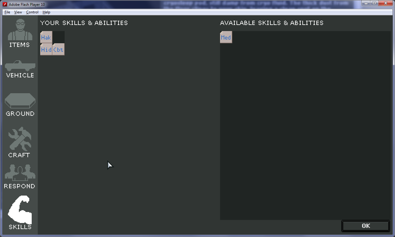
Skills, Quotes, and Fade to Black
When the player clicks "Play," they're immediately taken to a skills/abilities selection page. Here, they can choose what skills their character will have to use in surviving the wastelands.

Skill selection page, v2
While this screen existed before, it's undergone a slight revision. Namely, there are now disadvantage slots available. Each of the eye-patch icons in the lower left represent a slot for a disadvantage. Players can choose any disadvantage they want, up to four. Why would a player choose a disadvantage? Well, similar to GURPS and Fallout's S.P.E.C.I.A.L., I wanted disadvantages to allow for advantages beyond what a normal character can take. Willing to be myopic? Great! That gives you room for a few extra skills or abilities!

Extra skill/ability space granted for taking a disadvantage.
I enjoyed choosing handicaps to grant more room for benefits, and allow for greater customization of one's character. Currently, there is no reason to take a disadvantage, as the skill space is just enough to take all available skills at game start. However, I want to create additional skills, abilities, and disadvantages, so this will become a more meaninfgul choice in the future.

The above all happens while the game is loading the map. Map-loading can take a few seconds on my dev machine, and longer on older machines. In case the character creation step is completed before the game has finished loading, the user will see quotes that are relevant to the game universe. I want to use every available space to paint more depth in my game universe, and this is one such case.

Main Game UI
The main game UI has had a lot of work done as well. It's now possible to visually track one's character status via some colored status bars in the top left. As time passes in the game, the needles in these bars slide to show how the character is holding up (e.g. getting colder/hotter, more hungry, more tired). Each color represents a stage of hunger, fatigue, hypothermia, etc. As the needle crosses into gradually more red stages, penalties accumulate.

New in-game UI, including status bars and message window.
I think this pushed the game more towards "game-like" and further from "frustrating simulation." Previously, it was hard to gauge the current status of the player, and what was causing it to change. Now, the player can better see how their actions affect character status, including moving, equipping items, eating, etc.

To further enhance player feedback, a running message log was added to the lower left. It calls out status changes in hunger, temperature, etc., as well as when items are found in the current hex.

Scavenging and Sleeping
I also added some more buttons to the top right. "Sleep" causes the player to sleep in the current hex. The map disappears, and only the UI remains. All buttons disappear except a "Wake" button. If the player is in a yellow or orange fatigue state, "Wake" is not automatically successful, because the player is too tired. (A message in the log tells the player this is the case.) If the fatigue is in the green state, the player will automatically wake up.

The scavenge button was added to allow the player to search for items in the current hex. It takes movement points to execute, but may reveal useful items. Currently, that's the only way to find items in the game. A recent playtest with Rochelle revealed that this is probably not ideal, as she expected to find some items automatically as she wandered. I agree with her, and will probably change it so that scavenge finds more "out of the way" loot in a hex, in exchange for the movement points spent searching.

Encounter Improvements
I've spent quite a bit of time upgrading the encounter system to cover the types of encounters I want. One such change is the ability for encounters to spawn creatures on the map.

A dogman is stalking the player.
Each time the player ends their turn, the creatures move. If the creature is visible, the player sees it move one hex per second. Otherwise, it's instantaneous. For now, creatures are fairly simple AIs. If they detect the player in an adjacent hex, they go there. If not, they look for the player's "scent" in any adjacent hexes, and follows the strongest scent they can find. (The player leaves his scent wherever he goes, which fades over time.) Finally, if none of the above are possible, the creature wanders randomly. When a creature and player intersect on a hex, an encounter for that creature happens.

Encounters can also teleport the player to a new hex (handy for quick travel). Encounters can be triggered by date range, location, or hex type, with a certain percent frequency. They can also be unique, so they only fire once, and can trigger only on certain player conditions (or the absence thereof), which is handy for setting game variables like "player angered crime boss."

Encounters can also reveal distant hexes on the map. And to help give the player landmarks to go by, it made sense to give them an overview of the map. So I added a minimap!

Minimap, with labels.

The minimap is fairly crude, but it's a 1-to-1 relationship with the hex map the player sees. It makes navigating a bit easier on the player, as well as development easier for me. The map can be scrolled around in WASD fashion, with the ability to zoom out. Here, we can see the starting cryo facility labeled. Any revealed hexes can have labels as well.

Encounter Editor
Encounters were quickly becoming confusing to author, especially since one encounter can branch into zero or more other encounters based on character responses. So, I decided to take some time to make a visual tool for editing these encounter relationships. It makes encounter authoring much easier on me, and much faster. And since encounters are the meat of the game, I'm already reaping the benefits of an editor.

Try editing THAT in a spreadsheet!
As you can see, encounters are pretty complex flowcharts. That tangled mess at the top was my first game encounter. Seeing that has helped me restructure later game encounters to be easier to follow and maintain.

One thing to note about the editor: it uses fl.controls instead of Flixel. It still lives within a Flixel game state, but I needed quick access to text boxes, scrollbars, and select boxes. So I managed to load a swc with all those controls from Flash CS4, and that helped me get this editor up and running within a week.

Crafting and Item Conditions
I finally bit the bullet and hacked together crafting for the game. I think it was easier than the last time I approached this problem because more of the game is fixed in place now. With less wiggle room, decisions became clearer.

Crafting a campfire.

It's really cut and dry for now. The player adds items to the center "Ingredients" panel like they would any other container. If the ingredients can make something, it appears ghosted on the right along with a "Craft Item" button. Clicking that button removes all ingredients, and un-ghosts the crafted item for player use. Also, the discovered recipe appears in the left scrollbox for use later. Clicking any known recipe on the left tries to fill "Ingredients" with the necessary items from the player inventory or ground.

Regarding the campfire, I wanted the player to be able to place items in a hex to help them weather the night, take shelter, etc. So I made items bestow conditions (buffs) based on where they are stored or equipped. In this case, simply being in the same hex as a campfire warms the player, restoring his body temperature each turn he ends or sleeps there. This goes for clothing as well, which only works when equipped in the correct slots. Finally, I use this in a later encounter to trigger a quest option based on what the character is carrying.

Also, Other Stuff
A raft of other less-visible things have gone in as well. I've finished an overall story arc in Illustrator, and that's helping me keep everything in context for the game. The game architecture was changed from a sloppy if/else block to a more robust game state (within Flixel's "play state"). Now, I can more cleanly keep track of when the AI vs player are doing stuff, when game should be paused due to inventory or map screens, and what order the game should load data.

And of course, there's the game content. New encounters, new items, new hex types...this is going to continue for a bit. I'll also be continually tweaking game rules as I go. I've already started counting hex movement costs against player fatigue as an experiment. Now there's an additional reason to consider which hex to choose when traversing an area.

There's still much to be done, but I think the end is in sight. I have to stay disciplined now, try to keep scope in check, and keep my eye on the release as a real thing. And figure out how to get some wider playtesting done soon!

Sunday, September 4, 2011

Indie Developer Survey Results

After putting together the indie survey last week, I feel obligated to both my readers and other respondents to provide a follow-up with the results of that survey. So in today's post, I'm going to do just that.

The Results
For the most part, everyone with a web browser can see the same data that I can. So I'm not going to re-post the survey results directly.

Instead, I'm going to call out some of the more interesting things I noted. Some of it is based on some data crunching and slicing. And all of it is based on my personal bias, so please apply the appropriate context when reading.

Who Responded?
All told, it had a pretty good response rate. In one week of activity, it collected responses from 121 people (myself included). The lion's share (56%) went to those currently employed and considering becoming an indie. And of those, 62% were employed by a game studio. Surprisingly, indies only made up 27% of the respondents. In retrospect, it isn't impossible to imagine such an outcome. Perhaps the readership is skewed accordingly? Maybe word of the survey spreads faster among employee pools? Maybe employees are more willing to take time for surveys than indies? We can't say for sure, but those are some likely candidates.

I should also point out that my survey's first shortcoming turned up in the "employment situation" question. I left out two key groups in the survey, based on the phrasing:

  1. indies who are currently employed but working on games part-time.
  2. indies who became indies directly from school or other unemployed status.

Even with those accounted for, the variety of specific working conditions made that question contentious for some. It's safe to say that there is no small number of optional responses to that question that would satisfy all respondents.

What Are the Biggest Reasons People Go Indie?
Not surprisingly, the most popular reason for going indie was "creative freedom." 73% of all respondents cited that as a reason. "Sharing one's ideas with the world" is in second, with 58%, and "improved working hours" was 49%.

Interestingly, 47% of respondents cited "the chance to earn more than a salary and/or benefits." That's one I didn't expect, given my perceptions of the indie scene. Everything I've read to-date has suggested that if one is seeking money, indie is the last thing one should try.

Also, game studio employees had roughly the same top 4 reasons and percentages as non-game studio employees. I had expected a slightly different set of reasons between those two groups.

I did one other data slice to compare game industry employees to non-game industry employees. I checked which reasons game studio employees cite more often than non-game studio employees. Expressed as a ratio of game studio employees to non-game studio employees, here are the biggest discrepancies:

  1. Tired of the IP: 4.7:1
  2. Tired of the genre: 4.4:1
  3. Concerns with current project quality: 3:1
  4. Concerns with current project marketing/publishing support: 2.8:1
  5. Friends laid off: 2.1:1

The first two are probably to be expected. IP and genre probably don't figure into non-game employees' decisions if they work in an industry without a game IP or genre. #s 3 and 4 are interesting, though. Is project quality and marketing/publishing effort really that bad in the games industry, compared to other industries? Also, do game studio employees see more frequent layoffs than other industries? The above numbers may suggest just that.

What Are the Biggest Reasons NOT to Go Indie?
Asking the inverse question turned out to be similarly symmetric both in and out of the games industry, and equally unsurprising. The biggest reason? Inability to go without pay long enough to ship a game (54%). Lack of business acumen also figured in equally inside the industry vs. out, at 37%.

Two deviations did occur, however. First, "family depends on income" showed up more frequently outside the industry than in (43% outside vs. 30% inside). Also, game studio employees cited "liking coworkers" 34% of the time, compared to 20% outside the industry. It appears studios are hiring good people, and that matters to employees.

Also, one reason which was strong for studio employees vs. other employees was "liking current project." Despite the apparent dissatisfaction with IP, genre, and project management cited above, it appears 3 times more game studio employees like their projects than those outside the games industry. Wait a minute, based on the data in the previous section, that sounds like a contradiction. Why the discrepancy?

As it turns out, it's a very small fraction in both employee groups. 15% inside the industry vs. 5% out. So while more studio employees like their project than non-studio employees, they are both very low numbers overall.


What Did I Learn?
Did it answer any of my questions? Yes and no. Many of the responses are about what I expected, so I'm not sure how much I learned via the data directly.

However, I did learn some things from the failures of my survey:

  1. The employment situation of indies isn't as clear-cut as my first question implies.
  2. My provided reasons for becoming an indie are nearly complete (very few "Other" responses were wholly different than a provided option)
  3. Roughly 4% of indies had no fears or reasons not to become an indie. (as indicated by "Other" responses)

For a game studio, I think there are some useful lessons to be learned. If I were to list them, they would be (based on above data):

  1. Find a way to better engage employees' creative instincts, and let them express and share it with others. This can be creative input on the project, or on side projects. And my guess is there are as many non-content creators (e.g. programmers, QA) in group as there are traditional creative-types (e.g. artists, designers).
  2. Crunch is not yet a solved problem in our industry. Get off the crunch crutch already!
  3. Consider ramping-up profit-sharing alternatives. The fixed-ceiling compensation is stifling employees.
  4. Provide a greater latitude in genres and IPs for employees to work on, to prevent burn-out.
  5. Keep up the good work on hiring inspiring coworkers.

Improved project quality showed up frequently in responses as well, but I didn't list it above because it's a bit hard to interpret. Every studio's leadership wants improved quality, I'm sure. Unfortunately, you can't just pull the "improved project quality" lever. However, some things which might help include:

  • increasing employee input in project decisions (and therefore increasing employee buy-in)
  • avoiding projects with extreme constraints on time (e.g. movie tie-ins or financial quarter Hail Marys) or scope (e.g. sequels with little room for creativity/innovation)
  • allowing creative side projects on company time (e.g. Google Fridays, studio-wide Ludum Dare, etc.)
  • allowing creative side projects outside the company


Also, Marketing
I also learned a few things about marketing. For example, my personal internet reach is pretty small. Posting to the blog, twitter, Google+, and Facebook resulted in a limited number of results. It was pretty clear early on that I was going to need some more publicity to get useful results. So I started leveraging other communities where I saw indie discussions occurring.

Initially, that included a post on polycount.com, and a comment on a gamasutra.com blog. The former had shown up on my blog stats radar due to an "indie start-up" thread that linked to me, so I figured I'd give it a go. The latter was a comment on an article related to what made me put the survey together in the first place.

Later, I decided to use gamasutra's blog feature to make my first post. As it turns out, that was a good move. My post got featured on the first page as an "Expert Blog," resulting in a large increase in traffic. Both polycount and gamastura represented large influxes of readers for that week. Forum posts on indiegamer.com and tigsource.com made a difference too, but not quite to the degree of the former two.

It's taught me a bit about juggling target audience vs. audience size. Both indiegamer and tigsource are probably well-defined groups of readers who would appreciate the blog, but gamasutra and polycount generated a larger volume of interest. One piece of the puzzle which is missing, though, is who filled out the survey from which source? In other words, did 100% of 10 visitors from site A fill out the survey, and 1% of 100 from site B? And that's a big lesson learned: employ better metrics next time. For now, I'm satisfied knowing a bit about the reach I have, but I should've at least asked "how did you hear about this survey" in there somewhere.

So there you have it: The GDGR's first indie survey! Will I do another? Perhaps, but not until some time has passed. And not without some much needed edits. Until next time!

Thursday, August 25, 2011

Motivations for becoming an indie game developer


Survey Results
Unfortunately, the summary doesn't fit well into my blog's content area. So for those interested in seeing the real-time results, you can click on this link:

Motivations for Becoming Indie: Survey Results

Thanks for checking it out. With any luck, there will be some useful data in here for indies and studios alike!

Tuesday, August 16, 2011

Building an Indie Brand

So I played Pioneer Trail yesterday. (Bizarre aside: it took me longer than I expected to find a link to it via Google) A friend of mine invited me to try it, and I've been meaning to for a while. NEO Scavenger has its roots in a post-apocalyptic homage to Oregon Trail, so it makes sense to see someone's modern interpretation of a "Trail-like" game.

I'd played a social game or two before. (Literally, I've played two.) So one of the first things I did was to check the game permissions. I wanted to cut off all attack vectors from Pioneer Trail, so I didn't spam my friends' walls with game messages.

It started out innocently enough. You're presented with a small homestead, peppered with plants, rocks, and a few animals. The art is real slick-looking, and a friendly gap-toothed prospector fellow is helping you get started. You're hand-held through some user-friendly harvesting and clearing, and before you know it, you've leveled-up! And completed your first goal! And the game is now asking you to broadcast it to the world!

I declined, and continued to follow ol' toothless's advice. Sure enough, I managed to trip another game event that wanted to be broadcast. I think the rhythm was about one spam request per minute. I was glad I turned off as many of the game's permissions as I did.

Then, it was trail time. I was ushered into the trail mode, and told the virtues of "friending-up" for the trip. Each of the characters was demonstrated via tutorial. I didn't get much of a chance to see if any of the mechanics were reminiscent of Oregon Trail, because the game thought it was high-time I "friended-up." The entire interface shut down, except for a throbbing "hire a friend!" button at the bottom. No other buttons functioned anymore.

The game was literally dictating that, in order to continue, I'd have to reach out to a friend. Uncomfortable with the idea of bothering someone I care about just to try the game, I closed the app. And removed it from my Facebook entirely. I guess that's what folks call "rage quit" these days.

Slimy Games
As I was composing a message to my friend, describing my first impressions of the game, I couldn't help but notice I was getting riled up. Pioneer Trail really struck a nerve with me. This type of friend-peddling just seemed wrong to me. I kept thinking of the day I was helping my mom clear out all the wall posts from her friends' Facebook games.

"Why do they keep posting these on my wall?" she'd ask. And "I keep clicking on them to go away, but more keep cropping up." She just wanted to use Facebook to keep in touch with family and friends, but she could hardly see any through the wall of noise from games. I showed her a few tips for preventing apps from showing up, but there was always a new mole to whack.

She doesn't use Facebook anymore. That's right. She dropped a whole service, one which was actually helping her stay in touch with people she cared about, because of some disproportionately loud and annoying apps. Which brings me to the heart of this post.

Building an Indie Brand
A while back, I blogged about my core values. In #2, I talk about respecting the user. I want my game to treat the player as if they're someone special. I don't want DRM to get in the way of easily playing the game. I don't want to trick them into playing, or playing at certain times. I don't want to hang banner ads and placards all around my games like a kiosk in Times Square. And now that I'm reminded of the "creepy social game touch," I don't want to trick them into getting friends to play either.

I want to build games for people like me. People who enjoy sitting down with a cup of tea, and cracking into a deep, enjoyable, thoughtful game. I want people to go to my games because there aren't ads, spam, or friend requests chipping away at their suspension of disbelief. I want to make games that treat people the way I wish games treated me.

How the Hell Are You Going to Monetize That?
That's a good question. I'm not entirely sure yet. I do have a few streams in mind, though.

  1. Ads - Ads are almost universally regarded as a minor revenue stream in Flash games, so it isn't a huge sacrifice to axe them. And I think the brand gain to be had by being ad-free is more than worth it. So no ads.
  2. Sponsorship and Site Licensing - Sponsorship is an option, as is site licensing. Apart from the monetary gain, there's an advertising benefit to being featured on various portals. The potential downside is portal branding competing with my own brand, but I think that largely depends on the details of the arrangement. This seems like a reasonable avenue to keep open.
  3. Time-limited demo - NEO Scavenger is fairly well-suited to a time-limited demo format. It's an easy-to-understand business model, for both me and the consumer. Choosing a price point is a risk, though. Whatever number I choose, I'm cutting off a chunk of players uncomfortable paying that amount, and missing out on those comfortable paying more.
  4. Area-based demo - NEO Scavenger also fits into an area-limited model pretty well too. The game is bounded on all sides by obstacles, by design. It was originally my intention to allow free-play in the Michigan area, and charge for access to each of the zones outside of that. Each zone would have unique content to offer, but you'd have to buy passage to that zone. It'd be a pittance to cross the border each time, but players could also "buy-off" the ferryman, so to speak, for permanent access. I really like this model, as it allows for unlimited free play, and a "pay what you want" fee structure to get access to other parts of the game.
    The down side? It makes more sense to launch the game later, when this content is in place. I'd have to take more time to make the content.
  5. Player-Created Content - This one is likely part of #4 above. In this model, there is a zone which is entirely player-created encounters. I create a tool for making encounters, and charge for access to that tool (as well as the fee for playing in that zone, in #4 above). Players could rate encounters, and create "playlists" of encounters to tailor their experiences. The upside here is that it can supplement or replace the content creation budget of #4. It also fosters a community of content creators. The down sides include moderating user content, griefing, cheating (Monty-Haul encounters), and building the content creation and management tools.
  6. Microtransactions - I brainstormed a list of features that could be charged for. Things like buying premium listings for your created content, buying a clone in case you die, buying extra character slots, buying increased storage capacity or recipe capacity (for crafting), etc. All of which are viable, they just take development and community management time to implement.
So far, #s 2 and 4 seem like my favorites. As a player, #2 is invisible to me (maybe even my entryway to the game universe), and #4 makes sense to me. I would feel like I'm buying something of value, and being charged a fair price since I can play for free, and pay what I'm comfortable with for extra content.

All of this assumes I'm able to pull off the user account management and billing systems. My hope here is that I can leverage third-party services to handle as many transaction types as possible in one, easy interface. Social Gold/Google are candidates here. Zong is another I'm looking at. And with any luck, I can use their APIs to do the customer management, so I'm not storing any usernames, passwords, or billing info.

With my soft deadline of September rapidly approaching, and given some of the significant chunks of work implicit in the monetization section above, I appear to be behind schedule. But I'm still motivated, still pleased with my work so far, and still optimistic there is a chance at success here.

Monday, August 8, 2011

Close Encounters of the Close Kind

I've been working on the encounter system, and I think I've arrived at a working draft that serves well enough for the time being. Here's what it looks like:

NEO Scavenger's first encounter!
When the player has an encounter, this screen pops up. The player can see this encounter's details, and navigate to the other inventory and character sheet screens on the left menu, but they cannot exit back to the game board and continue moving until this encounter is dealt with.

The encounter screen itself is roughly divided into quadrants. Clockwise from the top left are:
  1. Illustration - an image depicting the encounter.
  2. Description - a text blurb describing the encounter. Also, there is a blurb of yellow text showing what your current response to the encounter is set to. In this case, the player has done nothing to respond yet.
  3. Response - This is the response area. The player can drag any number of items or skills into this area to formulate a response. At the bottom of this quadrant is an "OK" button. Once the user clicks this button when they are happy with the response they've chosen.
  4. Specials - This is the special encounter item area. Any items specific to this encounter which can be used are shown here. These items disappear when the encounter is resolved, and are replaced by new items when a new encounter occurs.
In this case, the player has awoken in a cryogenic stasis facility, and has no idea what is going on. The image in #1 is only coincidentally isometric, the game board has no such tiles. I was briefly tempted to create a cryo tile set, but I'm not sure I want to commit to making tilesets for each locale yet. #1 is mainly isometric because I'm better at iso pixel art than perspective painting.

#2 is currently some of the first game plot text the player sees. The player does not know who they are, why they're here, or where they are. Part of the game will involve answering those questions. However, a greater concern is pressing: something screams from down the hall, and is approaching fast.

#4 shows two scene items that were called out in #2: a door control panel and a broken window to the outdoors. The player can use these items (by dragging them into #3) alone or in combination with any items from their inventory, or skills they've chosen for their character (bottom item in left menu).

Once the player is satisfied with the response items they've chosen, they click the "OK" button. The screen updates to show the player the result of their response. This will usually take the form of a new encounter with no responses possible.

Basically, a dialog box.
During such a "no response" encounter, all navigation options are hidden, so the player isn't confused into thinking they can do anything to alter it. In this case, inaction has killed the player. But such "no response" encounters might also include parting words with an NPC, a status change on the player, new items being deposited in the current hex as loot, etc.

The result could also be another encounter, allowing a chain of encounters and responses to ensue.

I've written the encounter system such that there is a list of outcomes for each encounter, based on the items the user chooses as a response. If they fulfill the pattern for a response, a corresponding new encounter occurs. If not, there is a default encounter outcome that occurs. I wanted this to closely resemble the type of play that occurs in a pen and paper RPG session. The game master presents the player with an encounter, and the player can use any of the items or abilities available to their character to deal with it.

One issue which may surface as a result of this design is the temptation for "kitchen sink" responses. The player may just assume that if they throw everything they own into the response, they'll safely pass the encounter. That sort of breaks with the role-playing tradition, but I'm not sure it's my place to be policing play style in my game. Still, it would be nice if the game presented an actual challenge requiring critical and creative thinking to progress, rather than brute force.

Originally, I thought I could discourage this kitchen sinking by having any item used in the encounter consumed. It would definitely cause the player to be more stingy and selective. However, there are things like skills that I don't want consumed, even if used in an encounter.

I think an alternative way to dissuade kitchen sinking is to have the game simply take the first valid response it finds. Particularly, if undesirable outcomes are matched before more desirable ones, this should encourage players to be more selective with their responses.

This design is still subject to iteration. But it's reached a stage where it roughly matches the design, and I can create some test content for it.

Skills and Abilities
As part of the above system, I also roughed-out a skills and abilities system for the player. It's still very bare-bones, but it's enough to make encounters work reasonably close to the proposed design.

When the game starts, the player is presented with a skill selection page

Choosing skills for one's character.
The right side of the page has a list of available skills, and the left side is for skills the player already has. In this screenshot, the player has three skills: Hak (Hacking), Hid (Hiding), and Cbt (Combat), and the Med (Medicine) skill is available to take.

One thing you'll note is that skills are treated a lot like items. You can drag them around like items, and you have a place to store them. I want to see if this is sufficient for handling skills and abilities, as it allows me to leverage the existing inventory system code (and the player needs only learn one system for both items and skills).

One neat side-effect of this approach is that I can handle character development by adjusting the size of the player's skills container. As the player gains experience, I can simply increase their container size, so they can fit more skills into their space for use in encounters later.

When finished, I expect the right side of the screen to include many more skills than will fit on the left, so the player must choose carefully. I may even decide to have each skill item represent an increment of aptitude in a skill, such that a player can choose Hiding multiple times. Unlike the current system, where the simple presence of the Hiding skill determines success or not, I could change it such that each copy of Hiding used in an encounter increases the chance of it succeeding.

This multiple-copy approach would be a major leap towards mimicking traditional pen and paper RPGs, and I'm excited to give it a shot. I'd simply have to determine what scale to use for determining probability of success.