Thursday, August 25, 2011
Motivations for becoming an indie game developer
Survey Results
Unfortunately, the summary doesn't fit well into my blog's content area. So for those interested in seeing the real-time results, you can click on this link:
Motivations for Becoming Indie: Survey Results
Thanks for checking it out. With any luck, there will be some useful data in here for indies and studios alike!

Tuesday, August 16, 2011
Building an Indie Brand
So I played Pioneer Trail yesterday. (Bizarre aside: it took me longer than I expected to find a link to it via Google) A friend of mine invited me to try it, and I've been meaning to for a while. NEO Scavenger has its roots in a post-apocalyptic homage to Oregon Trail, so it makes sense to see someone's modern interpretation of a "Trail-like" game.
I'd played a social game or two before. (Literally, I've played two.) So one of the first things I did was to check the game permissions. I wanted to cut off all attack vectors from Pioneer Trail, so I didn't spam my friends' walls with game messages.
It started out innocently enough. You're presented with a small homestead, peppered with plants, rocks, and a few animals. The art is real slick-looking, and a friendly gap-toothed prospector fellow is helping you get started. You're hand-held through some user-friendly harvesting and clearing, and before you know it, you've leveled-up! And completed your first goal! And the game is now asking you to broadcast it to the world!
I declined, and continued to follow ol' toothless's advice. Sure enough, I managed to trip another game event that wanted to be broadcast. I think the rhythm was about one spam request per minute. I was glad I turned off as many of the game's permissions as I did.
Then, it was trail time. I was ushered into the trail mode, and told the virtues of "friending-up" for the trip. Each of the characters was demonstrated via tutorial. I didn't get much of a chance to see if any of the mechanics were reminiscent of Oregon Trail, because the game thought it was high-time I "friended-up." The entire interface shut down, except for a throbbing "hire a friend!" button at the bottom. No other buttons functioned anymore.
The game was literally dictating that, in order to continue, I'd have to reach out to a friend. Uncomfortable with the idea of bothering someone I care about just to try the game, I closed the app. And removed it from my Facebook entirely. I guess that's what folks call "rage quit" these days.
Slimy Games
As I was composing a message to my friend, describing my first impressions of the game, I couldn't help but notice I was getting riled up. Pioneer Trail really struck a nerve with me. This type of friend-peddling just seemed wrong to me. I kept thinking of the day I was helping my mom clear out all the wall posts from her friends' Facebook games.
"Why do they keep posting these on my wall?" she'd ask. And "I keep clicking on them to go away, but more keep cropping up." She just wanted to use Facebook to keep in touch with family and friends, but she could hardly see any through the wall of noise from games. I showed her a few tips for preventing apps from showing up, but there was always a new mole to whack.
She doesn't use Facebook anymore. That's right. She dropped a whole service, one which was actually helping her stay in touch with people she cared about, because of some disproportionately loud and annoying apps. Which brings me to the heart of this post.
Building an Indie Brand
A while back, I blogged about my core values. In #2, I talk about respecting the user. I want my game to treat the player as if they're someone special. I don't want DRM to get in the way of easily playing the game. I don't want to trick them into playing, or playing at certain times. I don't want to hang banner ads and placards all around my games like a kiosk in Times Square. And now that I'm reminded of the "creepy social game touch," I don't want to trick them into getting friends to play either.
I want to build games for people like me. People who enjoy sitting down with a cup of tea, and cracking into a deep, enjoyable, thoughtful game. I want people to go to my games because there aren't ads, spam, or friend requests chipping away at their suspension of disbelief. I want to make games that treat people the way I wish games treated me.
How the Hell Are You Going to Monetize That?
That's a good question. I'm not entirely sure yet. I do have a few streams in mind, though.
All of this assumes I'm able to pull off the user account management and billing systems. My hope here is that I can leverage third-party services to handle as many transaction types as possible in one, easy interface. Social Gold/Google are candidates here. Zong is another I'm looking at. And with any luck, I can use their APIs to do the customer management, so I'm not storing any usernames, passwords, or billing info.
With my soft deadline of September rapidly approaching, and given some of the significant chunks of work implicit in the monetization section above, I appear to be behind schedule. But I'm still motivated, still pleased with my work so far, and still optimistic there is a chance at success here.
I'd played a social game or two before. (Literally, I've played two.) So one of the first things I did was to check the game permissions. I wanted to cut off all attack vectors from Pioneer Trail, so I didn't spam my friends' walls with game messages.
It started out innocently enough. You're presented with a small homestead, peppered with plants, rocks, and a few animals. The art is real slick-looking, and a friendly gap-toothed prospector fellow is helping you get started. You're hand-held through some user-friendly harvesting and clearing, and before you know it, you've leveled-up! And completed your first goal! And the game is now asking you to broadcast it to the world!
I declined, and continued to follow ol' toothless's advice. Sure enough, I managed to trip another game event that wanted to be broadcast. I think the rhythm was about one spam request per minute. I was glad I turned off as many of the game's permissions as I did.
Then, it was trail time. I was ushered into the trail mode, and told the virtues of "friending-up" for the trip. Each of the characters was demonstrated via tutorial. I didn't get much of a chance to see if any of the mechanics were reminiscent of Oregon Trail, because the game thought it was high-time I "friended-up." The entire interface shut down, except for a throbbing "hire a friend!" button at the bottom. No other buttons functioned anymore.
The game was literally dictating that, in order to continue, I'd have to reach out to a friend. Uncomfortable with the idea of bothering someone I care about just to try the game, I closed the app. And removed it from my Facebook entirely. I guess that's what folks call "rage quit" these days.
Slimy Games
As I was composing a message to my friend, describing my first impressions of the game, I couldn't help but notice I was getting riled up. Pioneer Trail really struck a nerve with me. This type of friend-peddling just seemed wrong to me. I kept thinking of the day I was helping my mom clear out all the wall posts from her friends' Facebook games.
"Why do they keep posting these on my wall?" she'd ask. And "I keep clicking on them to go away, but more keep cropping up." She just wanted to use Facebook to keep in touch with family and friends, but she could hardly see any through the wall of noise from games. I showed her a few tips for preventing apps from showing up, but there was always a new mole to whack.
She doesn't use Facebook anymore. That's right. She dropped a whole service, one which was actually helping her stay in touch with people she cared about, because of some disproportionately loud and annoying apps. Which brings me to the heart of this post.
Building an Indie Brand
A while back, I blogged about my core values. In #2, I talk about respecting the user. I want my game to treat the player as if they're someone special. I don't want DRM to get in the way of easily playing the game. I don't want to trick them into playing, or playing at certain times. I don't want to hang banner ads and placards all around my games like a kiosk in Times Square. And now that I'm reminded of the "creepy social game touch," I don't want to trick them into getting friends to play either.
I want to build games for people like me. People who enjoy sitting down with a cup of tea, and cracking into a deep, enjoyable, thoughtful game. I want people to go to my games because there aren't ads, spam, or friend requests chipping away at their suspension of disbelief. I want to make games that treat people the way I wish games treated me.
How the Hell Are You Going to Monetize That?
That's a good question. I'm not entirely sure yet. I do have a few streams in mind, though.
- Ads - Ads are almost universally regarded as a minor revenue stream in Flash games, so it isn't a huge sacrifice to axe them. And I think the brand gain to be had by being ad-free is more than worth it. So no ads.
- Sponsorship and Site Licensing - Sponsorship is an option, as is site licensing. Apart from the monetary gain, there's an advertising benefit to being featured on various portals. The potential downside is portal branding competing with my own brand, but I think that largely depends on the details of the arrangement. This seems like a reasonable avenue to keep open.
- Time-limited demo - NEO Scavenger is fairly well-suited to a time-limited demo format. It's an easy-to-understand business model, for both me and the consumer. Choosing a price point is a risk, though. Whatever number I choose, I'm cutting off a chunk of players uncomfortable paying that amount, and missing out on those comfortable paying more.
- Area-based demo - NEO Scavenger also fits into an area-limited model pretty well too. The game is bounded on all sides by obstacles, by design. It was originally my intention to allow free-play in the Michigan area, and charge for access to each of the zones outside of that. Each zone would have unique content to offer, but you'd have to buy passage to that zone. It'd be a pittance to cross the border each time, but players could also "buy-off" the ferryman, so to speak, for permanent access. I really like this model, as it allows for unlimited free play, and a "pay what you want" fee structure to get access to other parts of the game.
The down side? It makes more sense to launch the game later, when this content is in place. I'd have to take more time to make the content. - Player-Created Content - This one is likely part of #4 above. In this model, there is a zone which is entirely player-created encounters. I create a tool for making encounters, and charge for access to that tool (as well as the fee for playing in that zone, in #4 above). Players could rate encounters, and create "playlists" of encounters to tailor their experiences. The upside here is that it can supplement or replace the content creation budget of #4. It also fosters a community of content creators. The down sides include moderating user content, griefing, cheating (Monty-Haul encounters), and building the content creation and management tools.
- Microtransactions - I brainstormed a list of features that could be charged for. Things like buying premium listings for your created content, buying a clone in case you die, buying extra character slots, buying increased storage capacity or recipe capacity (for crafting), etc. All of which are viable, they just take development and community management time to implement.
All of this assumes I'm able to pull off the user account management and billing systems. My hope here is that I can leverage third-party services to handle as many transaction types as possible in one, easy interface. Social Gold/Google are candidates here. Zong is another I'm looking at. And with any luck, I can use their APIs to do the customer management, so I'm not storing any usernames, passwords, or billing info.
With my soft deadline of September rapidly approaching, and given some of the significant chunks of work implicit in the monetization section above, I appear to be behind schedule. But I'm still motivated, still pleased with my work so far, and still optimistic there is a chance at success here.
Monday, August 8, 2011
Close Encounters of the Close Kind
I've been working on the encounter system, and I think I've arrived at a working draft that serves well enough for the time being. Here's what it looks like:
When the player has an encounter, this screen pops up. The player can see this encounter's details, and navigate to the other inventory and character sheet screens on the left menu, but they cannot exit back to the game board and continue moving until this encounter is dealt with.
The encounter screen itself is roughly divided into quadrants. Clockwise from the top left are:
#2 is currently some of the first game plot text the player sees. The player does not know who they are, why they're here, or where they are. Part of the game will involve answering those questions. However, a greater concern is pressing: something screams from down the hall, and is approaching fast.
#4 shows two scene items that were called out in #2: a door control panel and a broken window to the outdoors. The player can use these items (by dragging them into #3) alone or in combination with any items from their inventory, or skills they've chosen for their character (bottom item in left menu).
Once the player is satisfied with the response items they've chosen, they click the "OK" button. The screen updates to show the player the result of their response. This will usually take the form of a new encounter with no responses possible.
During such a "no response" encounter, all navigation options are hidden, so the player isn't confused into thinking they can do anything to alter it. In this case, inaction has killed the player. But such "no response" encounters might also include parting words with an NPC, a status change on the player, new items being deposited in the current hex as loot, etc.
The result could also be another encounter, allowing a chain of encounters and responses to ensue.
I've written the encounter system such that there is a list of outcomes for each encounter, based on the items the user chooses as a response. If they fulfill the pattern for a response, a corresponding new encounter occurs. If not, there is a default encounter outcome that occurs. I wanted this to closely resemble the type of play that occurs in a pen and paper RPG session. The game master presents the player with an encounter, and the player can use any of the items or abilities available to their character to deal with it.
One issue which may surface as a result of this design is the temptation for "kitchen sink" responses. The player may just assume that if they throw everything they own into the response, they'll safely pass the encounter. That sort of breaks with the role-playing tradition, but I'm not sure it's my place to be policing play style in my game. Still, it would be nice if the game presented an actual challenge requiring critical and creative thinking to progress, rather than brute force.
Originally, I thought I could discourage this kitchen sinking by having any item used in the encounter consumed. It would definitely cause the player to be more stingy and selective. However, there are things like skills that I don't want consumed, even if used in an encounter.
I think an alternative way to dissuade kitchen sinking is to have the game simply take the first valid response it finds. Particularly, if undesirable outcomes are matched before more desirable ones, this should encourage players to be more selective with their responses.
This design is still subject to iteration. But it's reached a stage where it roughly matches the design, and I can create some test content for it.
Skills and Abilities
As part of the above system, I also roughed-out a skills and abilities system for the player. It's still very bare-bones, but it's enough to make encounters work reasonably close to the proposed design.
When the game starts, the player is presented with a skill selection page
The right side of the page has a list of available skills, and the left side is for skills the player already has. In this screenshot, the player has three skills: Hak (Hacking), Hid (Hiding), and Cbt (Combat), and the Med (Medicine) skill is available to take.
One thing you'll note is that skills are treated a lot like items. You can drag them around like items, and you have a place to store them. I want to see if this is sufficient for handling skills and abilities, as it allows me to leverage the existing inventory system code (and the player needs only learn one system for both items and skills).
One neat side-effect of this approach is that I can handle character development by adjusting the size of the player's skills container. As the player gains experience, I can simply increase their container size, so they can fit more skills into their space for use in encounters later.
When finished, I expect the right side of the screen to include many more skills than will fit on the left, so the player must choose carefully. I may even decide to have each skill item represent an increment of aptitude in a skill, such that a player can choose Hiding multiple times. Unlike the current system, where the simple presence of the Hiding skill determines success or not, I could change it such that each copy of Hiding used in an encounter increases the chance of it succeeding.
This multiple-copy approach would be a major leap towards mimicking traditional pen and paper RPGs, and I'm excited to give it a shot. I'd simply have to determine what scale to use for determining probability of success.
 |
| NEO Scavenger's first encounter! |
The encounter screen itself is roughly divided into quadrants. Clockwise from the top left are:
- Illustration - an image depicting the encounter.
- Description - a text blurb describing the encounter. Also, there is a blurb of yellow text showing what your current response to the encounter is set to. In this case, the player has done nothing to respond yet.
- Response - This is the response area. The player can drag any number of items or skills into this area to formulate a response. At the bottom of this quadrant is an "OK" button. Once the user clicks this button when they are happy with the response they've chosen.
- Specials - This is the special encounter item area. Any items specific to this encounter which can be used are shown here. These items disappear when the encounter is resolved, and are replaced by new items when a new encounter occurs.
#2 is currently some of the first game plot text the player sees. The player does not know who they are, why they're here, or where they are. Part of the game will involve answering those questions. However, a greater concern is pressing: something screams from down the hall, and is approaching fast.
#4 shows two scene items that were called out in #2: a door control panel and a broken window to the outdoors. The player can use these items (by dragging them into #3) alone or in combination with any items from their inventory, or skills they've chosen for their character (bottom item in left menu).
Once the player is satisfied with the response items they've chosen, they click the "OK" button. The screen updates to show the player the result of their response. This will usually take the form of a new encounter with no responses possible.
 |
| Basically, a dialog box. |
The result could also be another encounter, allowing a chain of encounters and responses to ensue.
I've written the encounter system such that there is a list of outcomes for each encounter, based on the items the user chooses as a response. If they fulfill the pattern for a response, a corresponding new encounter occurs. If not, there is a default encounter outcome that occurs. I wanted this to closely resemble the type of play that occurs in a pen and paper RPG session. The game master presents the player with an encounter, and the player can use any of the items or abilities available to their character to deal with it.
One issue which may surface as a result of this design is the temptation for "kitchen sink" responses. The player may just assume that if they throw everything they own into the response, they'll safely pass the encounter. That sort of breaks with the role-playing tradition, but I'm not sure it's my place to be policing play style in my game. Still, it would be nice if the game presented an actual challenge requiring critical and creative thinking to progress, rather than brute force.
Originally, I thought I could discourage this kitchen sinking by having any item used in the encounter consumed. It would definitely cause the player to be more stingy and selective. However, there are things like skills that I don't want consumed, even if used in an encounter.
I think an alternative way to dissuade kitchen sinking is to have the game simply take the first valid response it finds. Particularly, if undesirable outcomes are matched before more desirable ones, this should encourage players to be more selective with their responses.
This design is still subject to iteration. But it's reached a stage where it roughly matches the design, and I can create some test content for it.
Skills and Abilities
As part of the above system, I also roughed-out a skills and abilities system for the player. It's still very bare-bones, but it's enough to make encounters work reasonably close to the proposed design.
When the game starts, the player is presented with a skill selection page
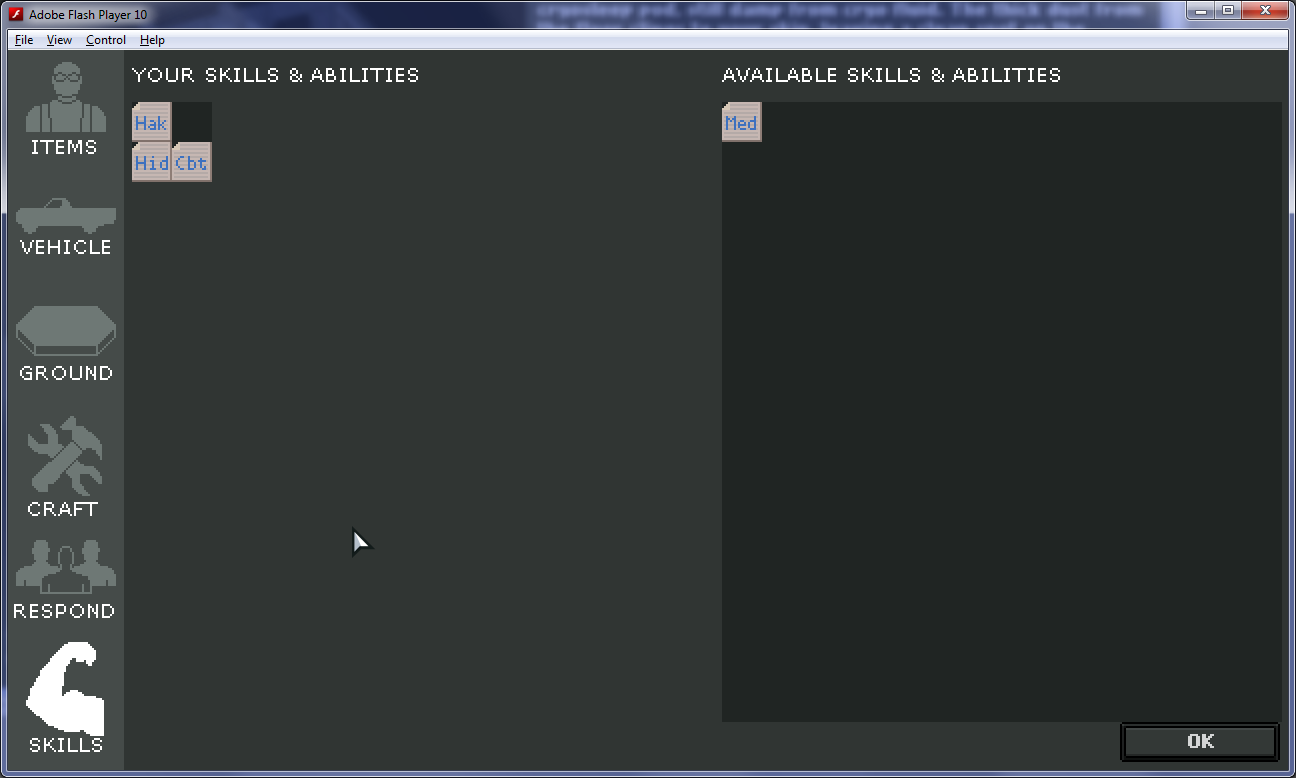 |
| Choosing skills for one's character. |
One thing you'll note is that skills are treated a lot like items. You can drag them around like items, and you have a place to store them. I want to see if this is sufficient for handling skills and abilities, as it allows me to leverage the existing inventory system code (and the player needs only learn one system for both items and skills).
One neat side-effect of this approach is that I can handle character development by adjusting the size of the player's skills container. As the player gains experience, I can simply increase their container size, so they can fit more skills into their space for use in encounters later.
When finished, I expect the right side of the screen to include many more skills than will fit on the left, so the player must choose carefully. I may even decide to have each skill item represent an increment of aptitude in a skill, such that a player can choose Hiding multiple times. Unlike the current system, where the simple presence of the Hiding skill determines success or not, I could change it such that each copy of Hiding used in an encounter increases the chance of it succeeding.
This multiple-copy approach would be a major leap towards mimicking traditional pen and paper RPGs, and I'm excited to give it a shot. I'd simply have to determine what scale to use for determining probability of success.
Monday, August 1, 2011
The Need for Struggle
As mentioned last post, I'm trying to make the first 5 minutes of the game playable. That means core systems are in place and working with each other. Once in place, I think I can begin focusing on the whole experience, and start tweaking it. Until now, I've been building and testing systems in near-isolation. I'd like to see if these systems can work in harmony, and start putting my efforts towards increasing fun factor.
So far, I wouldn't say the game is fun. While that doesn't overly worry me yet, it hasn't escaped me. I have a hunch that part of what's missing is a struggle. The player just wanders right now, and while he can die of hunger or exposure, it doesn't feel like a game. More like a (very dangerous) sandbox or toy. I recall my first experiences playing Minecraft.
What I didn't realize when I first tried Minecraft is that there are two versions of the game: Classic and Beta. With Classic being the free option, that was the one I chose to try first. In Classic, you have a lot of the same elements of Beta: you can move around a randomly-generated world, place blocks, and remove blocks. It was interesting to move around and build a few things in Classic, but I didn't really get what the big deal was. Fortunately, I came across this:
What I hadn't realized is that Minecraft Beta has a few extra, crucial features. Of course, crafting is one of them. Being able to pull resources from the blocks in the world and build tools and items from them is pretty interesting. But I have a feeling even that would rapidly grow old, as did the ultimate freedom of block-building in Classic.
But then the sun goes down, and monsters come out to kill you. Suddenly, it transformed from an idle Lego-like game to a desperate struggle to survive. You'd better hope you can mine enough wood and coal to carve out a torch-lit cave before nightfall, or else the exploding zombies and jumping spiders will destroy you.
My first game of Minecraft, in Classic mode, lasted about 10-15 minutes. And I might've said "that's nice," walked away, and forgot about it forever. My second game, in Beta, lasted several hours. And I still remember constructing my fortress of safety fondly. Even now, with the webpage open for screengrab purposes, I'm tempted to play it a bit.
I think I may be approaching a similar point in NEO Scavenger. I have several interesting systems in place, but I'm not sure why I'm playing. There isn't any pressure. No struggle. No resistance from the game. No opportunity to test my mettle.
So I'm focusing on the encounter system next. It can be a vehicle for introducing obstacles to the player, aside from hunger or exposure, and provides an opportunity for the player to be clever. It also makes finding loot and managing inventory more meaningful, since there will now be a use for that loot down the road.
Watch for screenshots soon. And if I can manage to make it cohesive enough, perhaps it'll be time to launch a pre-alpha for readers to try out?
PS: In the time it's taken me to shower and proofread this, I thought of some ways of making the food situation a little more game-y and less tedium. Be on the lookout for that too.
So far, I wouldn't say the game is fun. While that doesn't overly worry me yet, it hasn't escaped me. I have a hunch that part of what's missing is a struggle. The player just wanders right now, and while he can die of hunger or exposure, it doesn't feel like a game. More like a (very dangerous) sandbox or toy. I recall my first experiences playing Minecraft.
 |
| What most people first see when playing Minecraft. |

What I didn't realize when I first tried Minecraft is that there are two versions of the game: Classic and Beta. With Classic being the free option, that was the one I chose to try first. In Classic, you have a lot of the same elements of Beta: you can move around a randomly-generated world, place blocks, and remove blocks. It was interesting to move around and build a few things in Classic, but I didn't really get what the big deal was. Fortunately, I came across this:
What I hadn't realized is that Minecraft Beta has a few extra, crucial features. Of course, crafting is one of them. Being able to pull resources from the blocks in the world and build tools and items from them is pretty interesting. But I have a feeling even that would rapidly grow old, as did the ultimate freedom of block-building in Classic.
But then the sun goes down, and monsters come out to kill you. Suddenly, it transformed from an idle Lego-like game to a desperate struggle to survive. You'd better hope you can mine enough wood and coal to carve out a torch-lit cave before nightfall, or else the exploding zombies and jumping spiders will destroy you.
My first game of Minecraft, in Classic mode, lasted about 10-15 minutes. And I might've said "that's nice," walked away, and forgot about it forever. My second game, in Beta, lasted several hours. And I still remember constructing my fortress of safety fondly. Even now, with the webpage open for screengrab purposes, I'm tempted to play it a bit.
I think I may be approaching a similar point in NEO Scavenger. I have several interesting systems in place, but I'm not sure why I'm playing. There isn't any pressure. No struggle. No resistance from the game. No opportunity to test my mettle.
So I'm focusing on the encounter system next. It can be a vehicle for introducing obstacles to the player, aside from hunger or exposure, and provides an opportunity for the player to be clever. It also makes finding loot and managing inventory more meaningful, since there will now be a use for that loot down the road.
Watch for screenshots soon. And if I can manage to make it cohesive enough, perhaps it'll be time to launch a pre-alpha for readers to try out?
PS: In the time it's taken me to shower and proofread this, I thought of some ways of making the food situation a little more game-y and less tedium. Be on the lookout for that too.
Monday, July 25, 2011
New Hex Tiles and Items
Wrestling with inventory took quite a while, but I think it's better for the effort. This post, I figured I'd detour from code talk to show off some of the other stuff that's been percolating.
New Hex Art
First off, we have new hex art! The last round of hex art was a little too grainy and indecipherable for my taste. So I dusted off the Wacom and tried to spruce them up a bit.
So far, I'm pretty happy with the direction they're going. The style is reminiscent of 16-bit era pixel art, but with an expanded palette. I pushed colors slightly into cartoonish territory, but I think that helps the user to identify features better at this small resolution. (e.g. look at the forced highlights on the treetops)
In this shot, we can see the new urban ruins tile. It sports a skeletal skyscraper, complete with draped blue tarp and cables strung across the air to the neighboring brick high rise. And a few brownstones are sprinkled in for good measure.
While I like the tile a lot, it doesn't repeat well. It may be too busy for the primary city tile. The water is passable, but I may rework it later.
I also have a smattering of mountains in certain highland regions of Michigan. I liked them when I was drawing them, but in-situ, they just don't seem to fit the scenery well. I may have to save that art for something else, and replace them with greener mountains.
All this new art presents a new issue, however: draw-order. Both the player and the hex highlight are being drawn on top of the hexes. It ruins the illusion a bit. I'm thinking an easy solution might be to create a foreground graphic for each tile, and just draw it on tiles that need it (e.g. when player or highlight is in a hex). But I'll save that polish for later.
New Inventory Screen and Items
I also have a few shots of new items and the new inventory screen to show. First off, you'll notice I went with the third layout mentioned in my previous post.
Thanks to everyone for the input and support. I was a little overwhelmed, and your comments helped guide me to a solid solution. Most importantly, you reminded me that good, agile development means taking baby steps. I was trying to design the perfect system on paper, and forgetting that it'd be further defined by trying it out in-situ.
So what we have here is a paper doll UI with storage spaces. Simply drag and drop any item to an applicable slot, and it gets installed in that slot. Dragging a container to a slot creates a storage box alongside that slot for holding items. Drag any item into a box to store it. Only one item per slot now, but there are a hefty number of slots to play with. (e.g. one per foot, one per forearm, face, head, eyes, etc.)
In the above picture, the player has two plastic bags in his hands. Note: There are four hands in the paper doll. The attached ones are for gloves, the unattached ones (behind the bags) are for holding items. In the left bag, there's a wadded-up, brown t-shirt. He's wearing a hospital gown, a hospital wrist strap, and a talisman (more on the reasons for this starting loadout in a future post).
When dragging an item around, it gets highlighted blue when over a valid slot, and red otherwise. Valid slots that are empty are highlighted white. I've made equipped items semi-transparent during dragging in case slots are obsured (such as the legs under the gown). Here, I'm dragging a boot to the empty foot slot (boot image gets mirrored when installed, if necessary).
One final feature is the concept of equipped vs. stored items. Earlier, we saw this brown t-shirt crumpled into a plastic bag. Since inventory management was such a big deal in this game, I wanted to make sure items took an appropriate amount of space when stored. And since I had a paper doll, that meant one image for equipped, and one for stored. Containers will collapse when stored too, unless they have items in them.
I've started working on the encounter system now. I'm actually trying to make the initial 5-minutes playable, so that means I need some way of communicating a quick backstory, as well as negotiating an encounter. Not out of the UI woods yet!
New Hex Art
First off, we have new hex art! The last round of hex art was a little too grainy and indecipherable for my taste. So I dusted off the Wacom and tried to spruce them up a bit.

 |
| New plains, hills, forest, and suburb hexes. |
 |
| Approaching urban ruins along a river. |
While I like the tile a lot, it doesn't repeat well. It may be too busy for the primary city tile. The water is passable, but I may rework it later.
 | |
| A couple mountains along a river. |
All this new art presents a new issue, however: draw-order. Both the player and the hex highlight are being drawn on top of the hexes. It ruins the illusion a bit. I'm thinking an easy solution might be to create a foreground graphic for each tile, and just draw it on tiles that need it (e.g. when player or highlight is in a hex). But I'll save that polish for later.
New Inventory Screen and Items
I also have a few shots of new items and the new inventory screen to show. First off, you'll notice I went with the third layout mentioned in my previous post.
 |
| New inventory UI with new items. |
So what we have here is a paper doll UI with storage spaces. Simply drag and drop any item to an applicable slot, and it gets installed in that slot. Dragging a container to a slot creates a storage box alongside that slot for holding items. Drag any item into a box to store it. Only one item per slot now, but there are a hefty number of slots to play with. (e.g. one per foot, one per forearm, face, head, eyes, etc.)
In the above picture, the player has two plastic bags in his hands. Note: There are four hands in the paper doll. The attached ones are for gloves, the unattached ones (behind the bags) are for holding items. In the left bag, there's a wadded-up, brown t-shirt. He's wearing a hospital gown, a hospital wrist strap, and a talisman (more on the reasons for this starting loadout in a future post).
 |
| Dragging a shoe to a foot slot. |
 |
| Wearing a t-shirt. |
I've started working on the encounter system now. I'm actually trying to make the initial 5-minutes playable, so that means I need some way of communicating a quick backstory, as well as negotiating an encounter. Not out of the UI woods yet!
Tuesday, July 19, 2011
The Bag Lady Experience
So I think I may be going around the bend on inventory and crafting. I have this tingling feeling, and I can't tell if it's spidey sense warning me against over-ambition for my game, or if it's just some healthy fear of the unknown.
A few posts ago, I unveiled my first draft of inventory management. And as usability for inventory management often goes, it hobbled around shakily in the wild for a few moments before being torn asunder by a razor-sharp predator. I had Rochelle test it, while I watched over her shoulder (holding my tongue). Let's just say it didn't fare well. Even my own testing showed some extreme tediousness moving things around. And Mitchell's comment only further extinguished any doubt that this was the wrong approach. It was pretty clear version #1 wasn't going to cut it.
Which is a shame, since it was really elegant on the coding side: simple and extensible. But, as should've guessed from previous experience, simple and elegant code doesn't necessarily translate into ease-of-use.
So my next draft was going to include a somewhat more graphic UI. Instead of clicking on arrows alongside names of body parts to see the contents of that body part, the user could click on body parts in a silhouette to see items stored there. It looked something like this:
I think this was an improvement. In this version, rolling over any body part highlighted it, and clicking on it showed installed items for that body part in the center of the screen. In this mocked-up example, three items can be equipped into the current slot. I guess I figured I'd want to be able to wear three shirts at the same time, to simulate "the bag-lady experience." Alongside each slot is a storage area, that would only appear if an item was installed with storage space.
There were still some flaws, though. As Mitchell pointed out, it's nice to see everything you've got at once, and not have to click on menus to see additional items. In this case, one could (at best) see items on the paper doll, and in the current slot, before clicking. And that's assuming I could find a clever way to show all the items on the paper doll. Just looking at it, there's no way the hands and "HOLD" slots could fit some of the objects I envisioned going there (like a quarterstaff, or a rifle). And showing layered clothing was only going to complicate it further.
The three icons on the left were supposed to be other inventory-related screens one could get to. Dragging any item from the paper doll or center area onto one of those icons moves it to the first available slot in that icon's category. I figured the user could pile stuff into the crafting area, then switch to that screen to craft stuff.
But Mitchell's comment kept nagging at me. Why couldn't I try to show all items equipped and held at once? Why not bend over backwards to make the UI as easy as possible on the user? So I went back to the drawing board, and made version #3.
Ok, so now we can see everything the user is carrying at once. Equipped items show up over the silhouette, in place. Any equipped items with storage space enable the storage boxes surrounding the player. I backed-off "the bag-lady experience" and allow only one item per slot now. (Except for necklaces and rings, which have blow-out slots on the top and top-left, respecitvely)
In theory, this makes personal inventory management a breeze. Just drag-and-drop items around to equip or store them. No clicking sub-menus to see each set of items. And now that slots are restricted to one item each, I can actually display items on the paper doll.
But there are still two issues. First of all, this is going to be a bitch to make. There's going to be some special-case code in here, for sure. And the paper doll means extra artwork to make equipped items look good when combined. It's more work, but I think it's worthwhile work. Usability trumps elegant code, in this case.
The second issue is what to do about the other item-related UIs. All down the left-hand side of the screen are icons for other UIs that involve items. From top-to-bottom, they are:
It's #s 3 and 4 that scare me. Honestly, I spent half a day working on mockups of #3, and I'm still not satisfied. I looked at other crafting UIs out there too. I just haven't come up with anything that seems both intuitive and easy-to-use. Here's a rough mockup so far:
As you can see, it's extremely busy and clunky looking. I envisioned the user dropping items in the storage area on the left side (much like how the vehicle would work, above), toggling one or more pertinent skills in the middle list, and then clicking craft to create an item in the right storage area.
The trouble is that I think this'll be really tedious to use. I want this UI to support two types of behavior. First of all, I want the user to feel encouraged to experiment with item and skill combos to make stuff. That means lots of trial and error. Getting items into this screen is probably already too clunky to begin with, without having to do it dozens of times with different combos to see what results.
Secondly, I want the user to be able to quickly use already-discovered recipes. Somehow, the user should be able to browse recipes they already know, see whether they have the requisite materials, and craft one or more copies.
I'm not sure what to do. My brain became pretty burned-out after mocking up both the "Items" screen and this much of the "Crafting" screen. I needed a break from the UI design, so I decided to try and implement the "Items" screen as-designed, and come back to crafting later. I think "Items" is about as easy on the user as it can get, so it's probably safe to work on. The only thing better would be to integrate the other screens into the "Items" screen so the user didn't have to page-flip. But there's just not enough real-estate to do that.
Has anyone seen a crafting screen layout that might work here? Maybe I've made incorrect assumptions on the required inputs? I assumed skills would be a fun thing to include in recipes, since they act almost like verbs on the nouns of the item ingredients. But is that over-engineering? Do the skills add value? Maybe skills should be passive, so the user creates things with items only, and their skills determine the success rate or quality of the output? Maybe the user doesn't drag items from other screens into this one, but instead just sees all items they own here, and picks them from this screen?
Like I said. My brain was on "E" after hours on this problem, so I'll need to recharge before revisiting it. If anyone has insight, though, I'm all ears!
A few posts ago, I unveiled my first draft of inventory management. And as usability for inventory management often goes, it hobbled around shakily in the wild for a few moments before being torn asunder by a razor-sharp predator. I had Rochelle test it, while I watched over her shoulder (holding my tongue). Let's just say it didn't fare well. Even my own testing showed some extreme tediousness moving things around. And Mitchell's comment only further extinguished any doubt that this was the wrong approach. It was pretty clear version #1 wasn't going to cut it.
 |
| Version #1 |
So my next draft was going to include a somewhat more graphic UI. Instead of clicking on arrows alongside names of body parts to see the contents of that body part, the user could click on body parts in a silhouette to see items stored there. It looked something like this:
 |
| Version #2 |
There were still some flaws, though. As Mitchell pointed out, it's nice to see everything you've got at once, and not have to click on menus to see additional items. In this case, one could (at best) see items on the paper doll, and in the current slot, before clicking. And that's assuming I could find a clever way to show all the items on the paper doll. Just looking at it, there's no way the hands and "HOLD" slots could fit some of the objects I envisioned going there (like a quarterstaff, or a rifle). And showing layered clothing was only going to complicate it further.
The three icons on the left were supposed to be other inventory-related screens one could get to. Dragging any item from the paper doll or center area onto one of those icons moves it to the first available slot in that icon's category. I figured the user could pile stuff into the crafting area, then switch to that screen to craft stuff.
But Mitchell's comment kept nagging at me. Why couldn't I try to show all items equipped and held at once? Why not bend over backwards to make the UI as easy as possible on the user? So I went back to the drawing board, and made version #3.
 |
| Version #3 |
In theory, this makes personal inventory management a breeze. Just drag-and-drop items around to equip or store them. No clicking sub-menus to see each set of items. And now that slots are restricted to one item each, I can actually display items on the paper doll.
But there are still two issues. First of all, this is going to be a bitch to make. There's going to be some special-case code in here, for sure. And the paper doll means extra artwork to make equipped items look good when combined. It's more work, but I think it's worthwhile work. Usability trumps elegant code, in this case.
The second issue is what to do about the other item-related UIs. All down the left-hand side of the screen are icons for other UIs that involve items. From top-to-bottom, they are:
- Items - The current screen: personal inventory and paper doll.
- Vehicle - Any vehicle the user has found and equipped (anything from a shopping cart to a pick-up)
- Crafting - This is to be the screen where the user combines items and skills to craft other items.
- Respond - This is to be the screen where the user combines items and skills to respond to an encounter.
It's #s 3 and 4 that scare me. Honestly, I spent half a day working on mockups of #3, and I'm still not satisfied. I looked at other crafting UIs out there too. I just haven't come up with anything that seems both intuitive and easy-to-use. Here's a rough mockup so far:
 |
| Crafting UI Mockup |
The trouble is that I think this'll be really tedious to use. I want this UI to support two types of behavior. First of all, I want the user to feel encouraged to experiment with item and skill combos to make stuff. That means lots of trial and error. Getting items into this screen is probably already too clunky to begin with, without having to do it dozens of times with different combos to see what results.
Secondly, I want the user to be able to quickly use already-discovered recipes. Somehow, the user should be able to browse recipes they already know, see whether they have the requisite materials, and craft one or more copies.
I'm not sure what to do. My brain became pretty burned-out after mocking up both the "Items" screen and this much of the "Crafting" screen. I needed a break from the UI design, so I decided to try and implement the "Items" screen as-designed, and come back to crafting later. I think "Items" is about as easy on the user as it can get, so it's probably safe to work on. The only thing better would be to integrate the other screens into the "Items" screen so the user didn't have to page-flip. But there's just not enough real-estate to do that.
Has anyone seen a crafting screen layout that might work here? Maybe I've made incorrect assumptions on the required inputs? I assumed skills would be a fun thing to include in recipes, since they act almost like verbs on the nouns of the item ingredients. But is that over-engineering? Do the skills add value? Maybe skills should be passive, so the user creates things with items only, and their skills determine the success rate or quality of the output? Maybe the user doesn't drag items from other screens into this one, but instead just sees all items they own here, and picks them from this screen?
Like I said. My brain was on "E" after hours on this problem, so I'll need to recharge before revisiting it. If anyone has insight, though, I'm all ears!
Sunday, July 17, 2011
Trojan vs Indie
For the record, if one is ever contemplating how much time to set aside for technical issues in a 1-man operation, a full OS reinstall is a 1.5 man-day project.
Windows Defender found and removed a trojan a few days ago. It raised some concern for me, as I'm a pretty careful web user. But, WD claimed to remove it successfully, and my ESET online scan showed no infections. I figured I got lucky, and moved on.
Friday morning, WD found it again. The same trojan (Hiloti D, for reference). Now I was concerned. I went into paranoid mode, and started researching. WD claimed to succeed, and ESET seemed to agree. But I was suspicious. I realized I didn't have MS Security Essentials yet, so installed it. But quick scan came up empty.
However, I was starting to catch the subtle symptoms in action. That was it. I needed to do something, and I was considering the worst case: the trojan had compromised my OS, and potentially transmitted password info I typed into my browser. And it had a few days head-start. I ultimately decided on an OS reinstall, and changing all my passwords.
Friday and Saturday were coincidentally my weekend, as Rochelle and I decided on that arrangement not a day before. It gave us one weekday where I was off to run errands in town, if necessary, and one weekend day. One half-day of errands later, it was time to start the reinstall.
The reinstall went smoothly. Both times. Why install the second time? Because Windows Update was not-so-smooth. #20 of 90 got stuck for over an hour, and force-rebooting must've killed the restore points. Fortunately, that was #20 and not #90. So all told, backups, Windows 7 and 90 updates took most of Friday. And SP1, password changes, and reinstalling software took a good chunk of Saturday. Today, I still have a few essential tools to install before I can resume work, but the big stuff is out of the way.
So there you have it. A solo operation offlined for 1.5 days. It'll end up costing me a little production time today, and a lot of lost relaxation time over my weekend. The up-side?
Windows Defender found and removed a trojan a few days ago. It raised some concern for me, as I'm a pretty careful web user. But, WD claimed to remove it successfully, and my ESET online scan showed no infections. I figured I got lucky, and moved on.
Friday morning, WD found it again. The same trojan (Hiloti D, for reference). Now I was concerned. I went into paranoid mode, and started researching. WD claimed to succeed, and ESET seemed to agree. But I was suspicious. I realized I didn't have MS Security Essentials yet, so installed it. But quick scan came up empty.
However, I was starting to catch the subtle symptoms in action. That was it. I needed to do something, and I was considering the worst case: the trojan had compromised my OS, and potentially transmitted password info I typed into my browser. And it had a few days head-start. I ultimately decided on an OS reinstall, and changing all my passwords.
Friday and Saturday were coincidentally my weekend, as Rochelle and I decided on that arrangement not a day before. It gave us one weekday where I was off to run errands in town, if necessary, and one weekend day. One half-day of errands later, it was time to start the reinstall.
The reinstall went smoothly. Both times. Why install the second time? Because Windows Update was not-so-smooth. #20 of 90 got stuck for over an hour, and force-rebooting must've killed the restore points. Fortunately, that was #20 and not #90. So all told, backups, Windows 7 and 90 updates took most of Friday. And SP1, password changes, and reinstalling software took a good chunk of Saturday. Today, I still have a few essential tools to install before I can resume work, but the big stuff is out of the way.
So there you have it. A solo operation offlined for 1.5 days. It'll end up costing me a little production time today, and a lot of lost relaxation time over my weekend. The up-side?
- I have a fresh Windows 7 install, which I was probably due for.
- I have a better awareness of security issues on my setup, and have patched some of those holes.
- I finally broke down and bought a NAS and some 2TB HDDs upon which we can store data we don't want lost in a PC crash. (Which also gives me enough space to write restore system images, if necessary)
- I read some interesting articles, and got acquainted with newgrounds.com while waiting for Windows Update to finish!
Subscribe to:
Posts (Atom)